 |
| Top view |
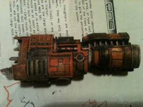
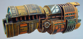
I couldn't resist these beauties when I saw them. Lovely design from those talented people at Spartan Games.
 |
| The flotilla |
As you can see from the unpainted shots, these are hybrid white metal and resin miniatures. I guess that this is to prevent those prongs breaking off at the front.
 |
| Size comparison |
 |
| Cruiser top view |
 |
| Battleship Front View |
 |
You can see how the white drybrush
really picks the detail out |
To start, I used a grey primer, and once that was dry, I drybrushed the ships all over with white. This really makes all the detail stand out, and is an ideal start for ink washes, which is what I'll be doing on these models.
 |
With the grey undercoat and white drybrush,
the detail comes out naturally when ink is applied |
Here you see the first coats of ink going on. I invariably use slightly different shades of a colour when painting models at tiny scales such as these. I've helpfully taken shots of the colours I used.
 |
| Sminky pinky |
 |
| Dinky thingy |
 |
Here I've added a coat of sepia ink over the
orange parts to add depth |
 |
| Linky stinky |
 |
| Inky inky |
 |
| More with sepia |

As you will have seen in my other posts, I use a variety of brands. I do think that many of the brands sold to wargamers and modellers are overpriced. A visit to your local art shop can save vast amounts of money if you're a prolific painter. Of course, it could mean you just spend the same, but get more :)
I've also used Liquitex interference paint, having achieved good results on my Covenant forces for Dystopian Wars. The paints themselves don't seem anything special on application, but with a wash over them, the interference effect shines through.
 |
| more orange |
 |
| more brown |
My original concept was to have a striking black and orange force - some of the colours have strayed toward a raw sienna however. I used sepia and blue inks mixed to produce a bluey-black.
 |
| more sienna |
 |
| pale orange/sienna mix |
After the darker ink washes, some areas still didn't have the right amount of darkness - this is where I started using my pens. Pigment markers from pilot and staedtler, plus POSCA ain't markets for some of the larger holes ensured a deep black. The metallic orange (or copper to you and I) marker made a fine highlight for the interference areas. An orange POSCA was good for fine lining, and the white POSCA was good for clean engine base coat.
 |
| here they come |
 |
| walkin' down the street |
 |
| they're the spaciest people |
 |
| you'd ever want to meet |
In the next installment, I'll be super-detailing and possibly adding some design to these otherwise fairly bland paint jobs.
 |
Overhead shot of a cruiser,
the forward grille has been picked out with a POSCA marker |
 |
| Front view of same |
 |
| Panels picked out with orange POSCA |
 |
| Battleship underside |
 |
Bridge lights picked out with POSCA
- super-detailing still to be done |
 |
| The Bridge and engines |


2.jpg)


